
Techniques for layering HTV using the knockout method
Hi everyone, it’s Bonnie from Expressionsvinyl.com. I want to show you how quick and easy it is to use a knockout method (also known as subtract or cookie cutter) using your silhouette. A knockout method allows for the appearance of multi-layered vinyl, but eliminates the bulkiness of layers by using only one layer.
Let’s get started:
Materials used:
Fonts:
- LD Elegance Bold
- Impact
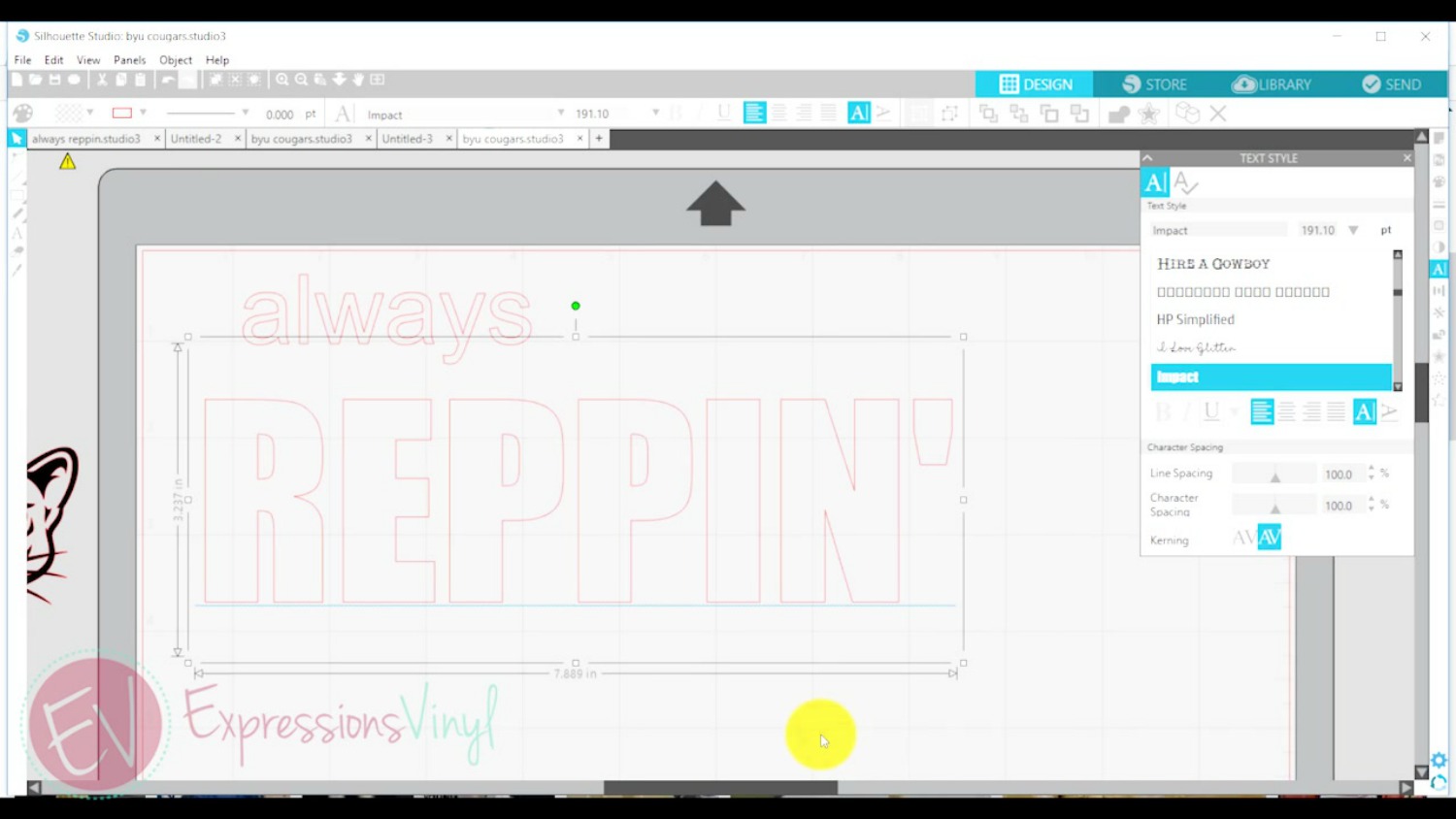
When selecting font choose a bold thick font, as this will affect how well your image shows up in your font. Impact font is great to use for a knockout.
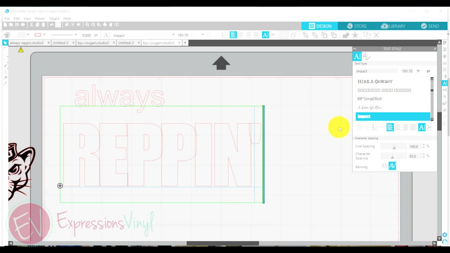
You also want to make sure the letters are very close together with minimal space between them. Move the letters closer together using Character Spacing in the Text Style panel. Above you can see that Character Spacing will not make equal distance between each letter, although it did move the letters closer together.
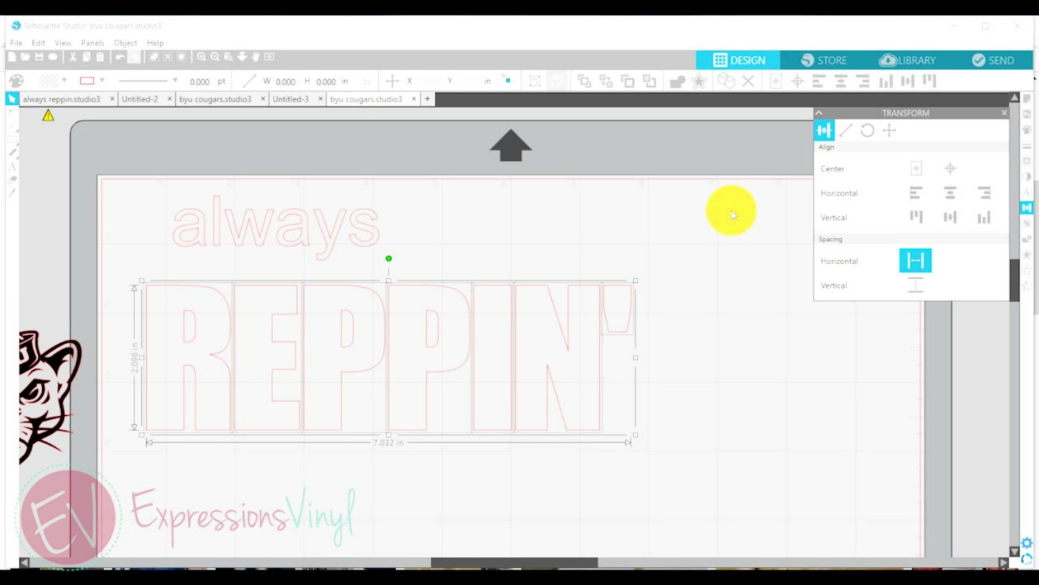
To make sure there is equal distance between each letter; Ungroup the letters, Select all letters, and use the Horizontal Spacing in the Transform Panel.
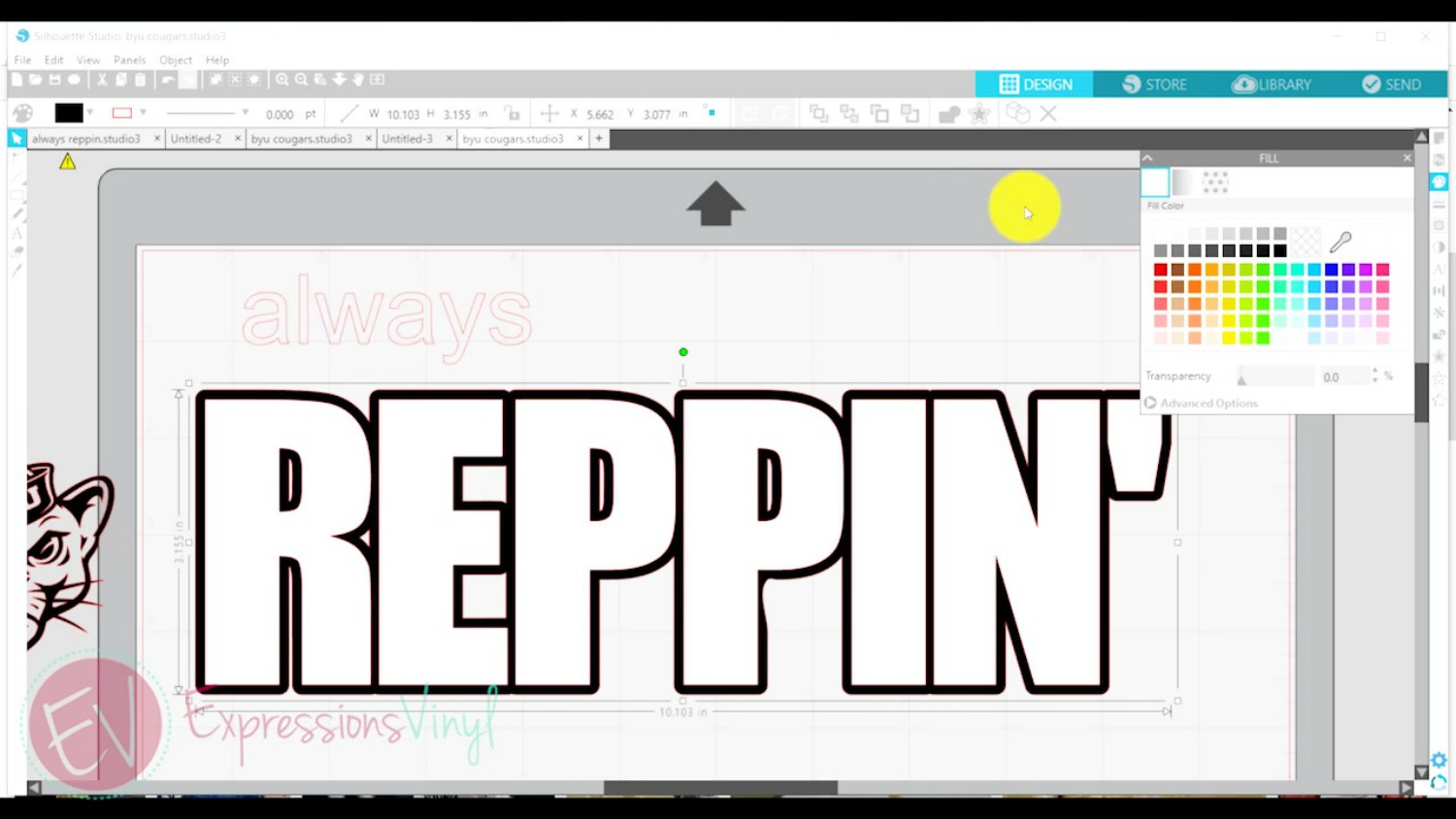
For this design I chose an offset which would make the letters pop out even more.
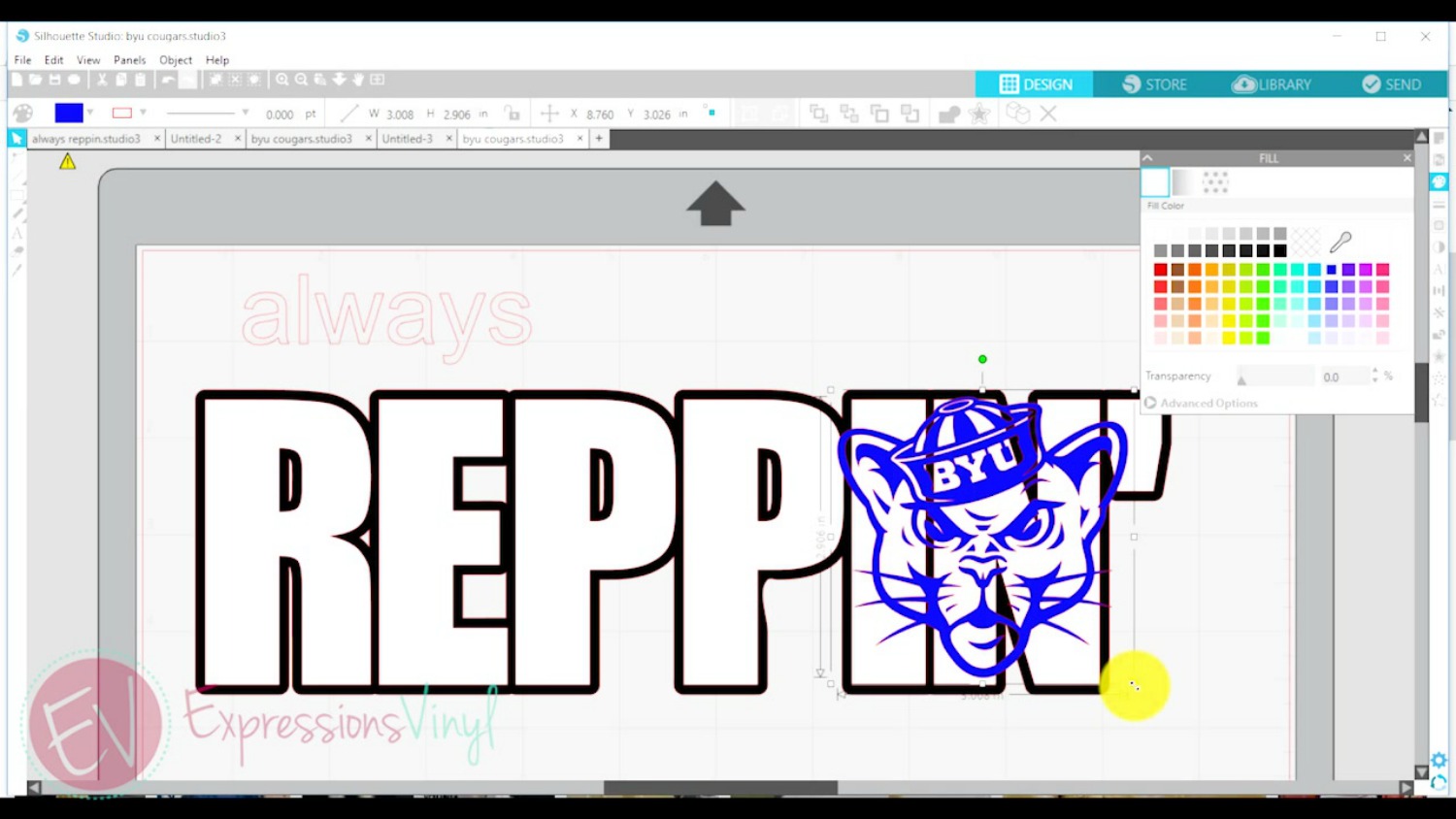
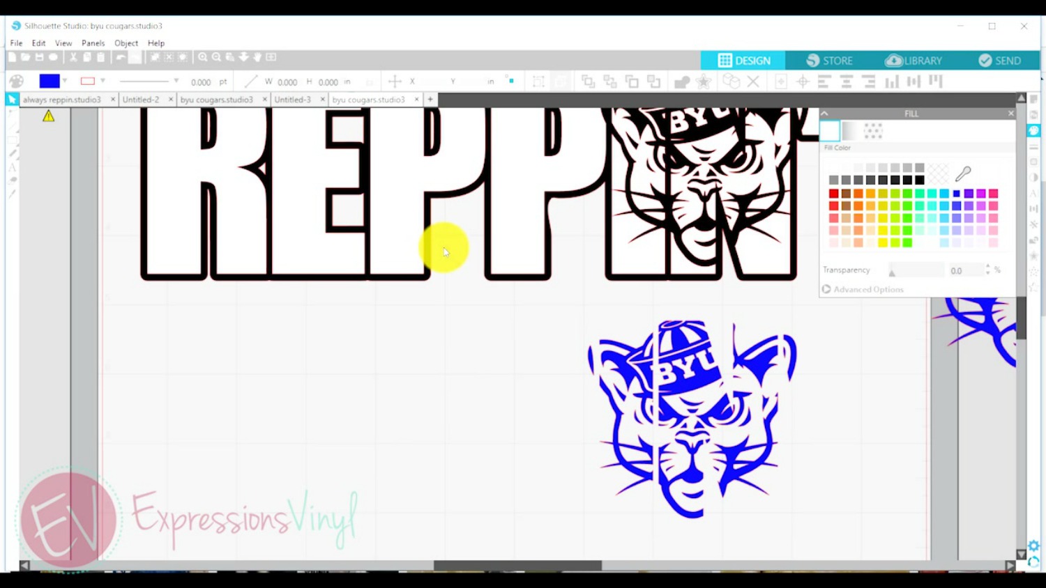
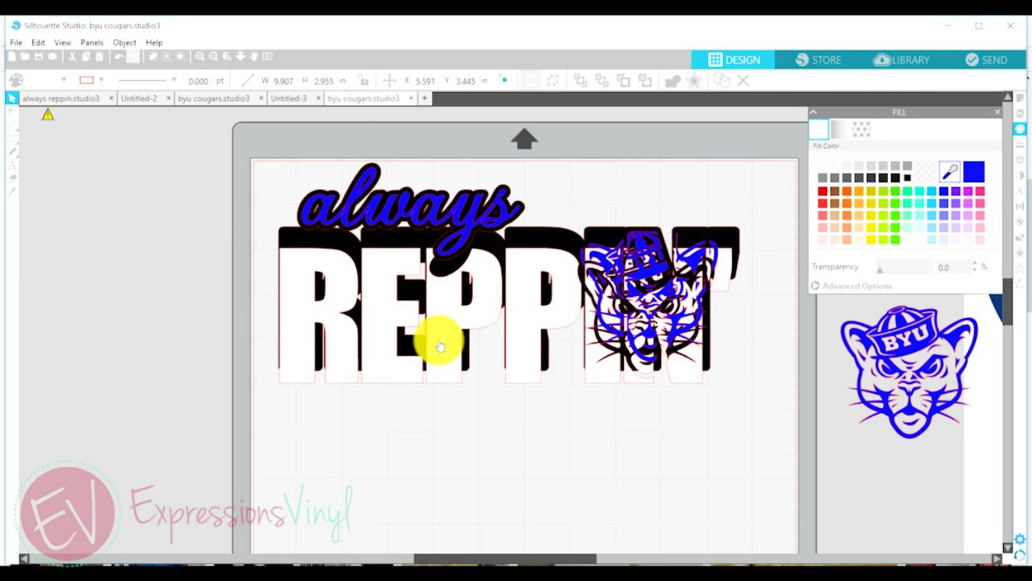
Next I placed my cougar image onto my letters, sizing the cougar image according to how large I wanted it. For the knockout, I want the blue cougar and the white letters to be only one layer instead of the blue on top of the white creating two layers and extra bulkiness.
To do this, select the white lettering and blue cougar, make a duplicate copy, then move the duplicate to the workspace below.
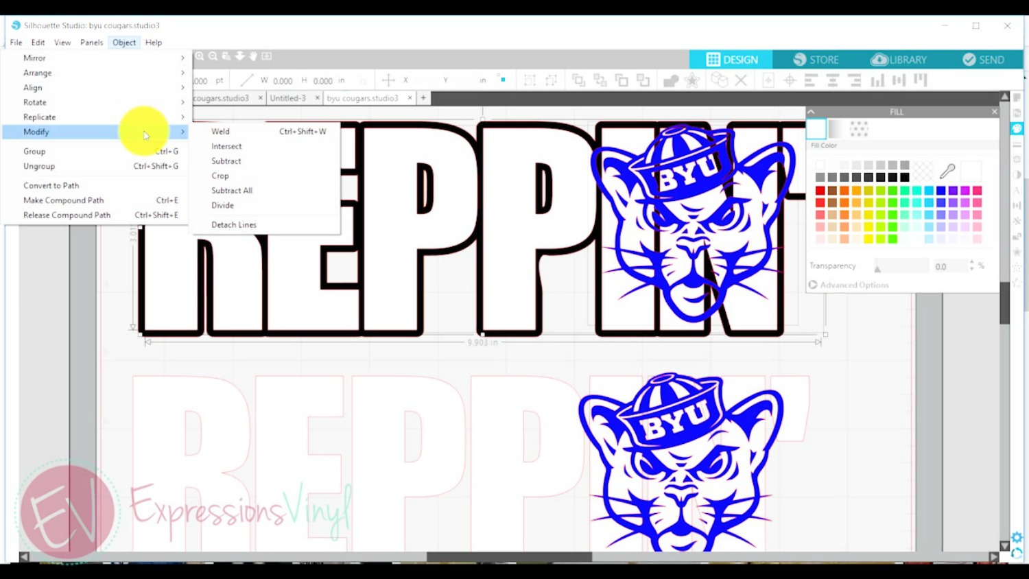
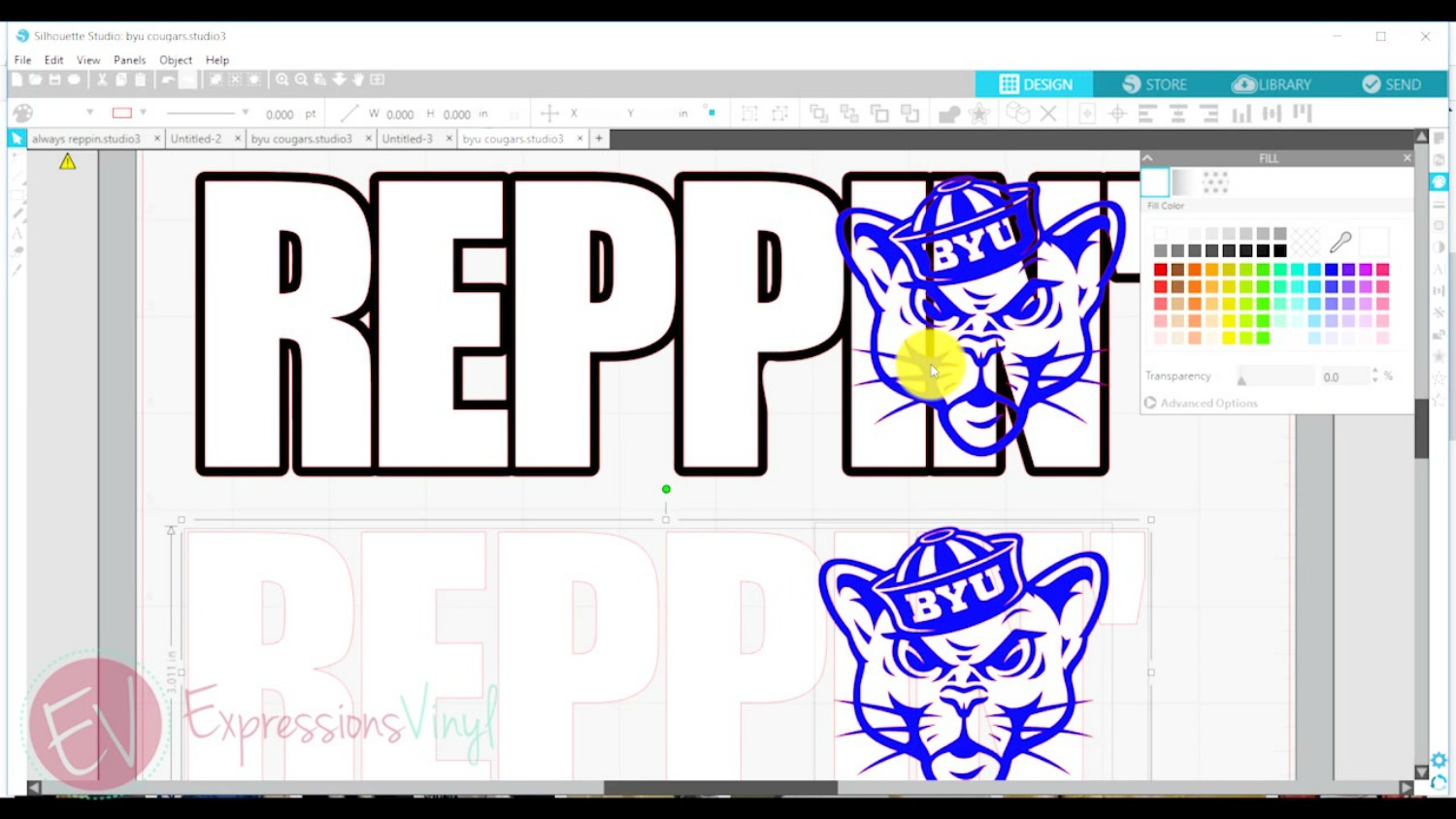
Select the original two images you are trying to manipulate, in this case the white lettering and the blue cougar. Then in the Modify Panel select Subtract All. You can then move the blue cougar image out of the lettering and see that it has been cut out or removed (subtracted) from the white lettering. (Whatever image is on top will be cut out of the bottom layer.)
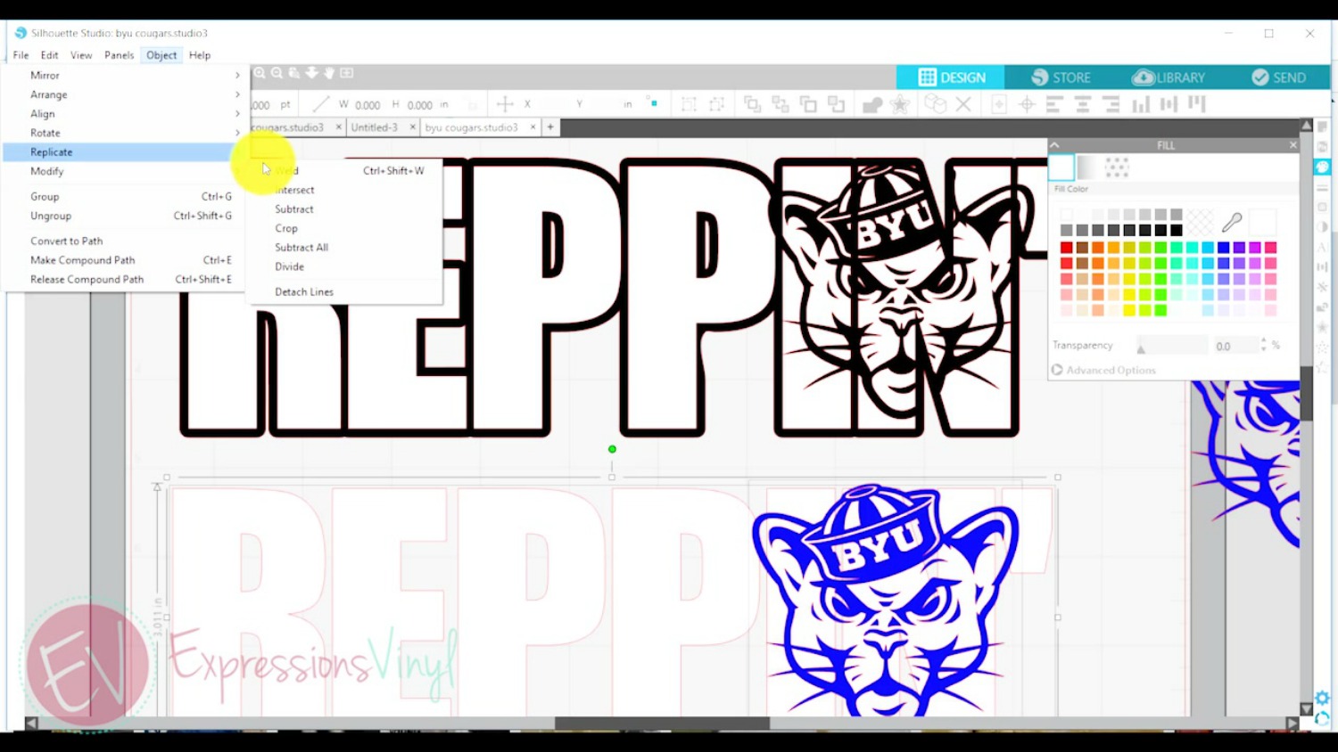
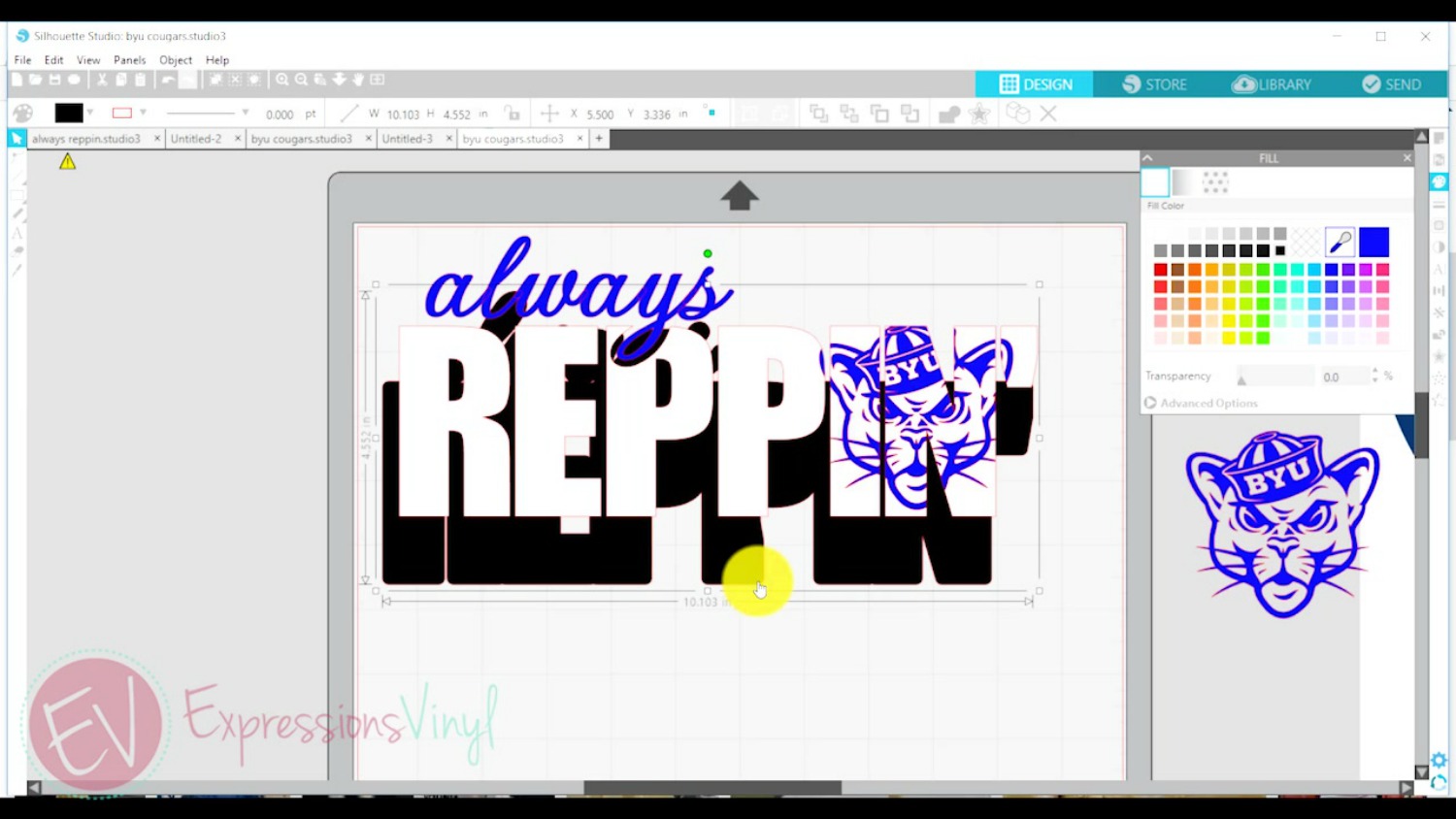
WIth the duplicate image that was moved below, select both the lettering and the cougar. In the Modify Panel select Crop. This will crop the white lettering from the cougar image.
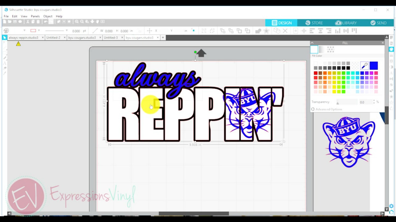
As shown above, the cougar is now in pieces. Select Group to make the cougar appear as one image and now it is ready to move back up to the original workspace.
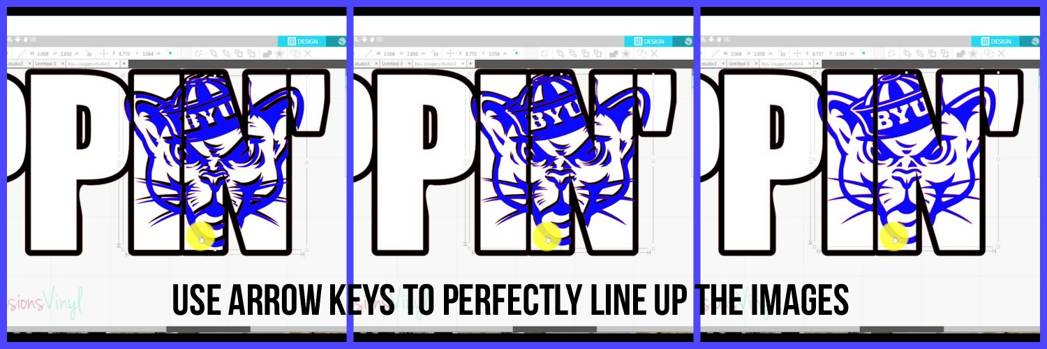
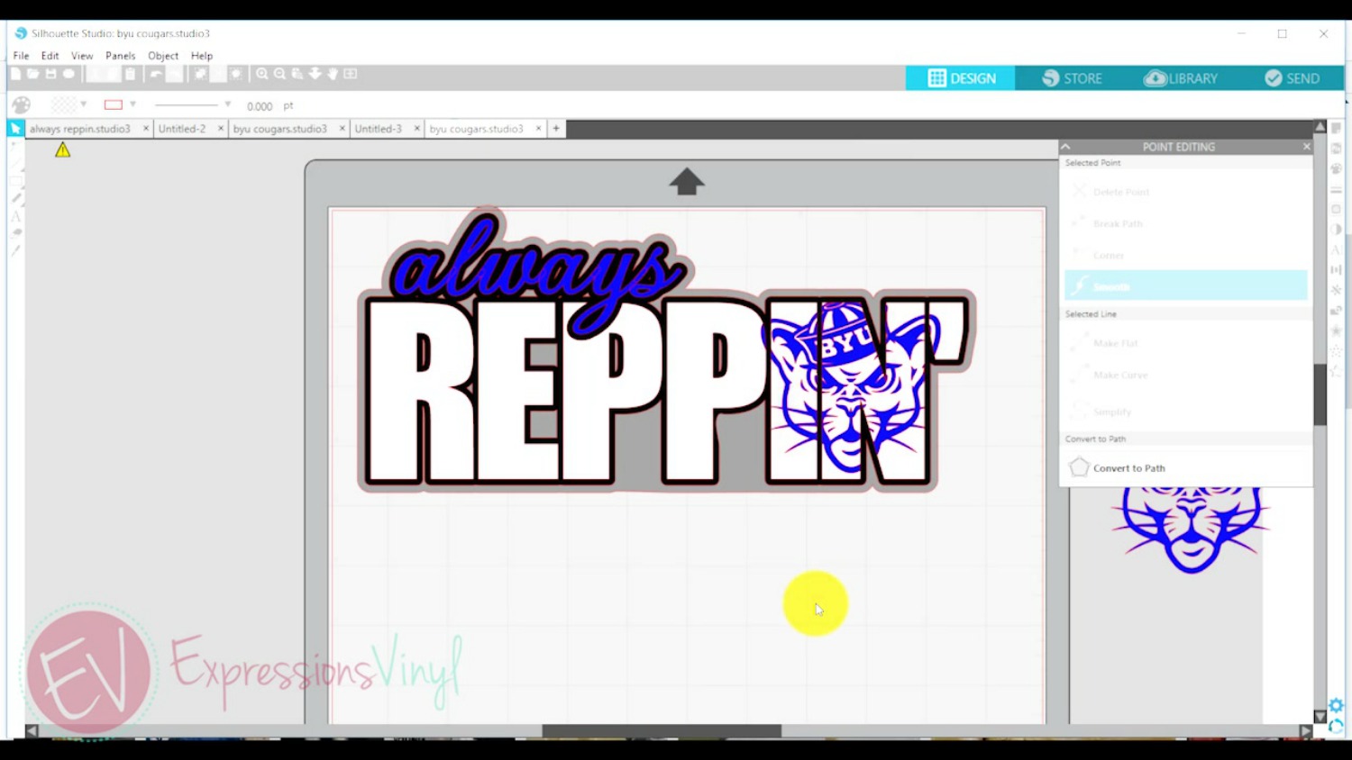
Zooming in will help assure both images are lined up.

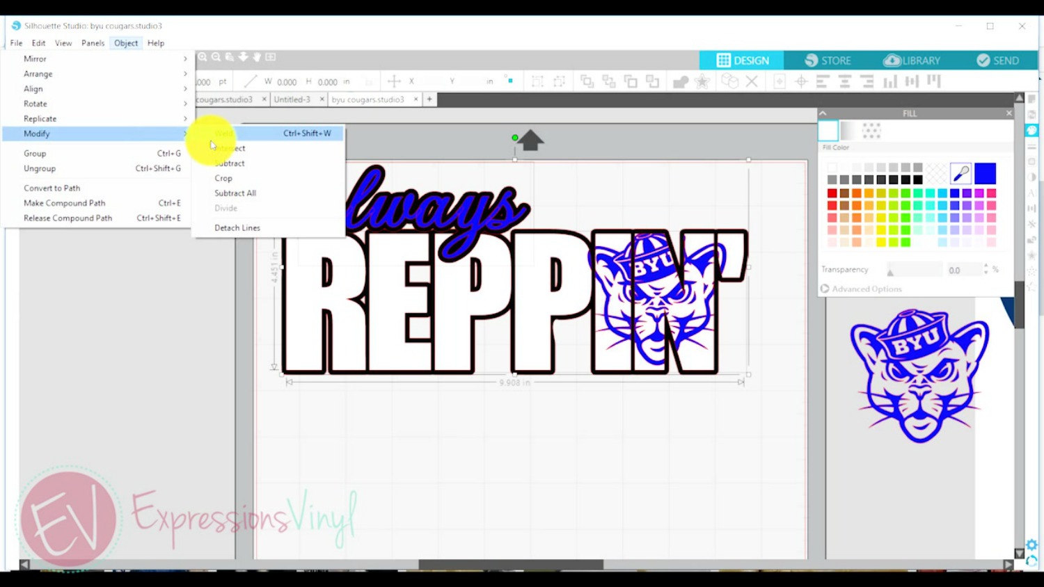
I’m going to apply this same concept to the word ‘always’ in my design. I created an offset on the word ‘always’ separate from the word ‘Reppin’ so that the tail on the y would be outlined in black. Selecting both words together for the offset (always and Reppin) would have resulted in an outline around everything as one image, thus not outlining the tail of the y.
For this knockout I am going to select the black offset in my word ‘always’ and the white of the word “reppin.’ In the Modify Panel select Subtract All.
The image below now shows the tail of the ‘y’ has been cut out (subtracted) from the white letters.
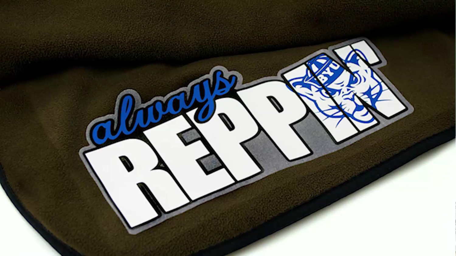
Lastly, I need to combine (weld) both of the black offsets together so they become one piece as shown below.
For this design I decided to add one more offset around the entire image using grey stripflock. Now it’s ready to cut, and don’t forget to reverse those images before cutting!
I’m so happy with the way it turned out and it will be perfect for all those cold football games.
If you have any questions or comments, please leave them below and I’m happy to answer them!

Recent Posts
-
NEW Holographic Eclipse Heat Transfer Vinyl
April 15th, 2024 3 Ways to Use the New Holographic Eclipse Heat Transfer Vinyl from Siser …Apr 29th 2024 -
Hop into Spring with Cute Easter Vinyl Crafts
Do you love our Vinyl? Sign up for Vinyl Club today to get FREE vinyl and save big! …Mar 28th 2024 -

Fixing Wrinkles and Bubbles in Vinyl
How do you get air bubbles out of vinyl? There are a few different ways to ensure a flawless …Mar 26th 2024